
Bumblebee
School Logo & Branding
The Client
Bumblebee English is a new English School located in Osaka.
The Challenge
They wanted a logo that was fun and friendly, but also professional. They also wanted a mascot that could be used for merchandise and other promotional materials.
Initial Research & Development
Bumblebee English Academy wanted something simple and fun to appeal to their young students. The main lettering was a success right away, we went back and forth on finding a good font for 'English Academy'.
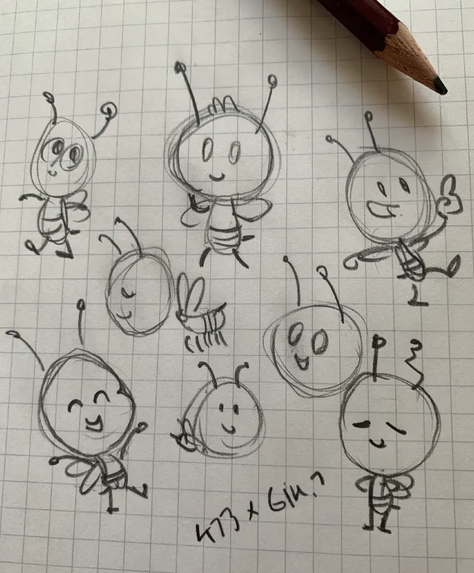
I tried a few variations on a cute bumblebee character. This page of sketch cam out on top, so I decided to continue from here.
Trying a Few Looks Out
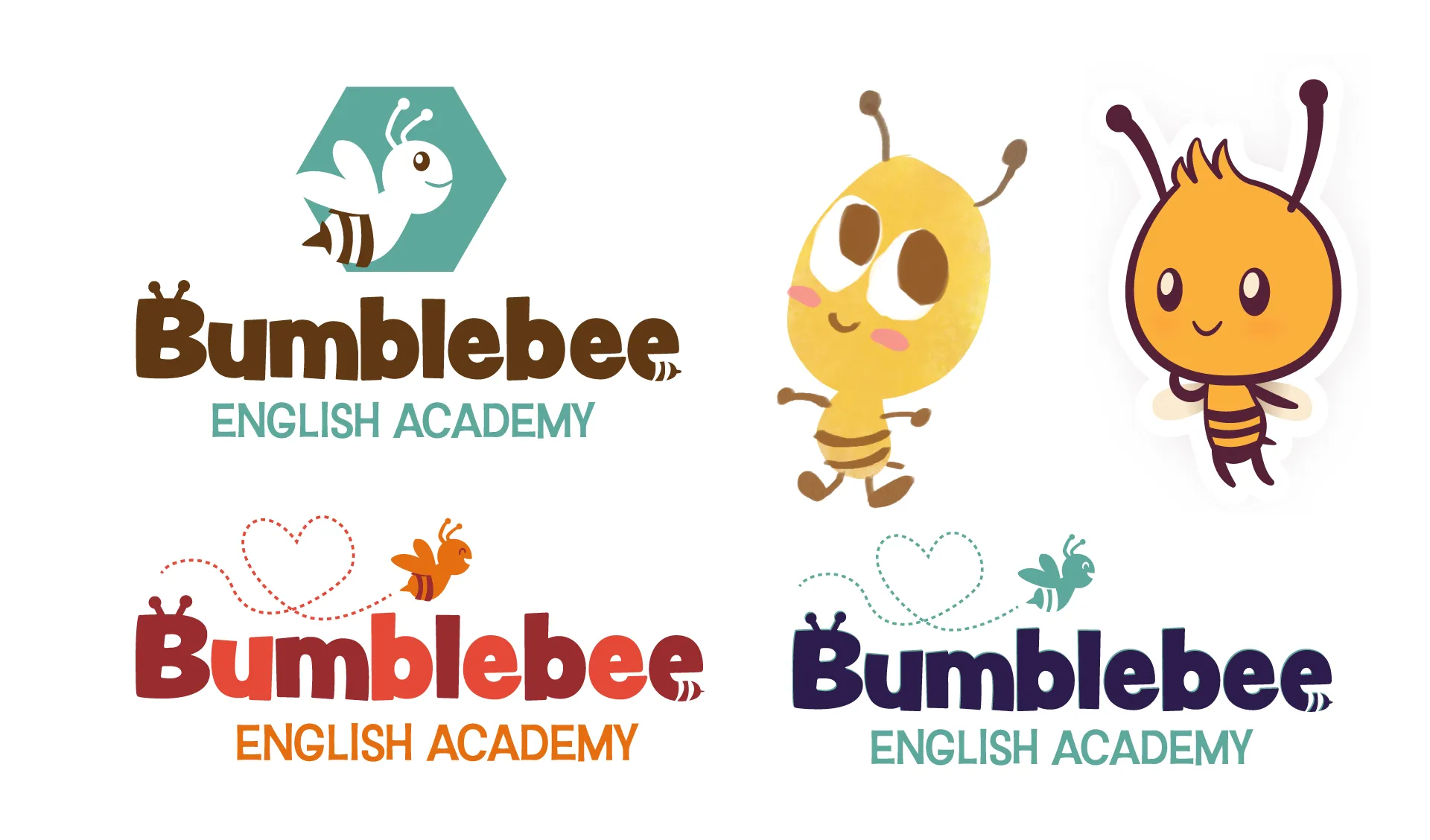
I tried incorporating a stylistic bee to the logo itself. I handed them this art with a few different color variations.
I then made two versions of the bee character in two different styles based on the previous sketches. The painterly one looked good with animations, but just didn't fit right with the logo.

Expanding Variations & Sprucing up the Art
The client liked the letter styling of the logo, but thought the graphic bee above it was too much, so we took it out of the equation. I experimented with a bunch of different colors and styles to find the right look.
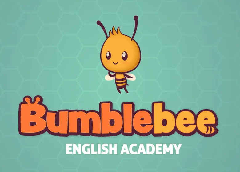
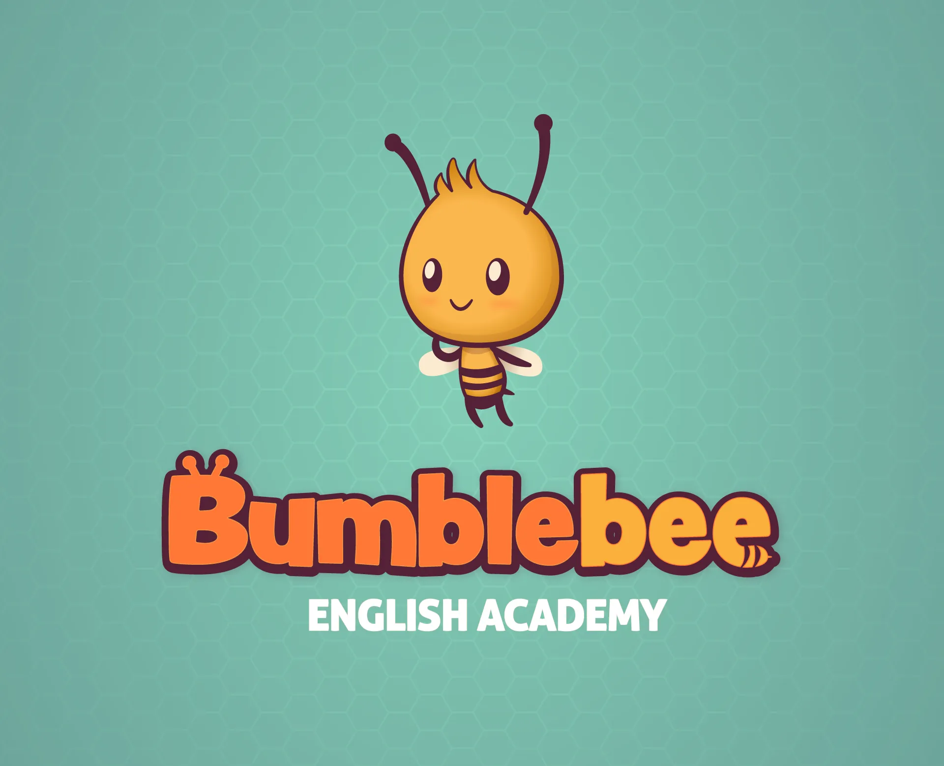
Now that the bee mascot was approved, I adjusted the colors a bit and added some sutble shading to give it a more rounded, kid-friendly appearance.
Bumbling Along to the Finish Line!
With the final logo settled on we decided to actually change the 'English Academy' text. Sometimes that initial work pays off, sometimes it was a learning lesson!
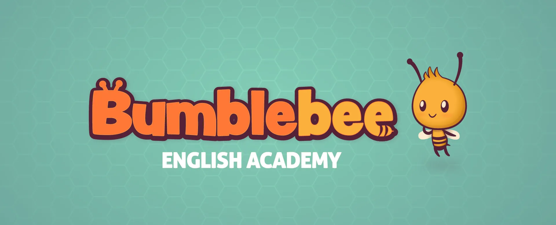
Finally, we put it all together and adjusted the background color a bit to bring everything nicely together.
This is only the beginning of this particular project. I'll be developing the website and print material in the future as well.